

Connecting users with their perfect hair stylist


role
deliverables
timeline
User Persona
Task Flows
Wireframes
Branding
Hi-fidelity Prototype
Product Designer
80 hours
problem
People don’t trust just anybody to style their hair. Because of this, it can be time-consuming and frustrating for users to find a hairstylist who meets all their needs - from their budget to their location to whether the stylist can specialize in certain hair textures, cuts, and colors.
goal
Create a (MVP) end-to-end mobile app that helps users easily find hair stylists who meet their various wants and needs.

understanding the user’s motivations
and needs through research
user research
I surveyed 13 people between the ages 25-45+ and interviewed four women between the ages 26-31 to understand which factors are most important in the hair stylist search process. I also wanted to learn the frustrations people are having with finding a stylist.
The most important factors users consider when choosing a hair stylist include:
Price
Reviews
Location
Portfolio
Stylist’s level of experience
Stylist’s personality
The biggest frustrations users encounter when looking for a hair stylist include:
No pricing online
Outcome of hair won’t come out as expected
Stylist not listening to their needs
Too time consuming finding a stylist
No availability
competitive analysis
I conducted a competitive analysis where I compared both direct and indirect competitors.
A direct competitor, Style Seat, had a lot of great features for finding stylists, but it didn’t have a great matching system and the user still had to do a lot of the searching themselves before finding a perfect stylist match.
Through the surveys and user interviews, I found that most people were using web search and social media to find their stylists. However, with these methods there wasn’t a way to filter by various needs.

Click image to enlarge
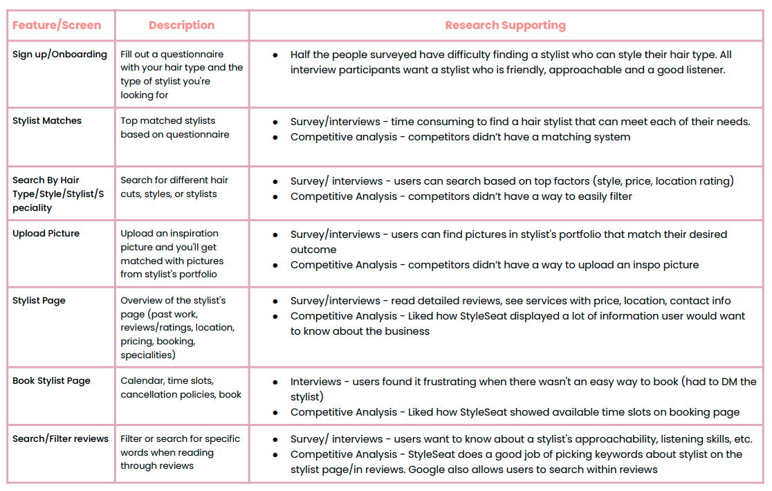
Based on the interview, survey and competitive analysis findings I created a list of features I wanted to include in the app. This would then help me to begin mapping out the user and task flows.
Click image to enlarge

user persona
Based on the research findings, I created a persona with the user’s needs/goals, motivations, and pain points in mind.

bio
Cindy recently moved to a new city to to pursue her career as a sales lead. Since she is constantly working with clients face-to-face, she always wants to make sure she looks and feels confident. One of the ways she feels more confident is getting her hair done. She always feels her best when her hair is cut, colored, and styled. Since she doesn't know anybody in the new city, she needs a way to find a reputable hair stylist that will meet her hair goals.
needs & goals
Quick and easy way to find a reputable hair stylist
Hair stylist who can meet her specific hair needs (somebody who works with long, thick, curly hair and specializes in balayage color technique)
Hair will match the inspiration picture accurately
Stylist is friendly and listens to her needs
Stylist meets her budget and isn't located far
frustrations
Spending hours searching for a stylist nearby who'll match her specific criteria
Hair result not matching the inspiration picture
Stylist isn't friendly or accommodating
Stylist doesn't know how to work with her hair type
how might we?
With the insights I received from the competitive analysis, survey results, and user interviews I created How Might We statements to pose the main problems users were having with their search and to start creating solutions.
how might we create an app that helps users:
save time looking for a hair stylist?
find a stylist in their price point and their location?
find a stylist who communicates and listens?
find a stylist who can achieve their desired request?
find a stylist that styles their specific type of hair?

ideating solutions based on user needs
developing task and user flows
Based on the user persona and the insights from my competitive analysis and user interviews/surveys, I created both a user flow and three different task flows. The three task flows include:
Completing the onboarding questionnaire
Finding the ideal stylist
Booking an appointment
Creating the user flow allowed me to understand how I wanted to break out different sections in the onboarding/questionnaire. Based on insights from the competitive analysis and the user interviews/surveys I was able to understand the most popular factors that could impact what a user looks for when booking a stylist. As a result, I broke down the questionnaire by:
Personal questions (user’s age, ethnicity, location)
User’s current hair (length, hair type, texture)
User’s desired look (cut, color, etc.)
User’s stylist preference (stylist’s personality, level of experience, availability)
The research I conducted also helped me understand the next steps to include in the user journey which consisted of reviewing the stylists and then booking an appointment.
After I created the user flow, I created a task flow to help me pinpoint all the screens I would need to create for my wireframes.


sketches to hi-fi
Based on the task flows, I created multiple sketches for each screen/page on the site. I wanted to brainstorm a variety of ways to lay out the site and see which layouts would be the best option for the user. After receiving feedback on my low-fidelity sketches, I created the mid-fidelity and high-fidelity wireframes.
One of the key screens that changed from my lo-fidelity sketches to my hi-fidelity screens included the Matches screen.
In my initial sketches of the Matches screen I had a gallery of client pictures and the CTA “view profile” button as the main focuses of the stylist’s at-a-glance profile.

In my mid-fi wireframes I made a change by including a picture of the stylist on the matches screen, the match percentage, and a heart icon so user’s could favorite specific stylist profiles.

After receiving feedback from other designers and my mentor I decided to remove the stylist picture on the matches screen and only use one picture instead of a gallery for the client photos. These changes helped to save space on the screen and not overwhelm the user with so much information at once. I also decided to remove the larger CTA button and replace it with just the “Learn More” text so there wouldn’t be too many primary CTA buttons on one screen.

design decisions in high-fidelity
1. how might we help users save time looking for a hair stylist?
Complete a Questionnaire
During sign up, users can answer questions about their hair type, desired look, ideal stylist and more - they’ll then be recommended stylists based on their answers. An onboarding questionnaire was important to include because the app is then able to collect profile information that can be used to deliver more personalized content to the user - saving the user time from searching for their specific needs.

2. how might we help users find a hair stylist in their price point and their location?
Set preference for price and location during questionnaire.
In the questionnaire users have the opportunity to set their preferred distance (up to 100 miles) and price (new talent to master specialist) for their stylist.


Display price and location on stylist profile.
While on the “Discover” page, it was important to include the price and distance on the stylist’s profile overview so users could get a quick glance if the price and location met their preference.

3. how might we help users find a hair stylist that meets their communication preferences?
Set preference for stylist personality during questionnaire.
Based on the user interviews, it was important for users to find a stylist they could easily communicate with. As a result, I included a question where users could choose their preferred stylist’s personality.

Have past clients review the stylist’s communication skills
Another way for users to get a sense of a stylist’s personality was through reviews. Past clients can review the stylist’s personality and then users reading reviews can easily see tags about the stylist (are they personable, attentive, on time, a good listener?)

4. how might we help users find a hair stylist that can achieve their desired look?
Set preference for desired look during questionnaire.
In the questionnaire, users can answers questions about their desired look such as their desired service (haircut, color, extensions, styling, etc). Once users choose their desired service, they can answer more detailed questions (type of cut, type of color, etc.)

Upload an inspiration photo
During the questionnaire users have the chance to upload an inspiration photo of their desired hair. The inspiration photo will then be matched with stylists who have similar photos in their portfolio.

Showcase stylist’s specialties and display pictures of past client results.
Give users the ability to easily see what the stylist specializes in by displaying tags on the discover page and a speciality section on the stylist’s profile page.
On these pages, users can also see past client photos to see if the stylist has done similar styles to their desired look.

5. how might we help users find a hair stylist that can style their specific type of hair?
Answer questions about hair type during questionnaire.
During the questionnaire, users can answer questions about their hair such as hair length, type/texture, and thickness. This way, users will get matched with stylists who can manage specific hair types.

List types of hair the stylist specializes in.
On the discover page and stylist’s profile page, users can view the stylist’s various specialties - including if they specialize in certain hair types (curly hair, long hair, thick hair, etc.). This ensures users are going to see a stylist who can specialize in their hair type.


making iterations based on user feedback
testing the initial prototype & making changes
After creating the prototype I conducted a usability test with three users. Based on the feedback I made design iterations on the following task flows:
onboarding iterations
before
2/3 users were unclear about the difference between curly and coily hair.
Make descriptions clear for the user

after
I added a “Learn More” option that shows an overlay of picture examples for the different hair types.

before
2/3 users were unclear about the difference choices of hair thickness. The original copy described the different volumes as “handful”, “headful,” and “whole bunch.”

after
I changed the copy for both the question and the choices of hair thickness so they were described in more clear terms: “thin”, “medium”, and “thick.”

discover page iterations
Make matches more clear
before
Users wanted to know what they didn’t match with on the stylist so they could have a better idea of who would be the best stylist for them.

after
I added a set of tags that show the answers the stylist didn’t match with the user. This makes it easier for users to eliminate any stylists that don’t meet certain needs.

stylist profile iterations
before
Users were able to book a service from the services tab and selecting “See Times.” 2/3 users suggested to make this action more clear.
Make “Book Appointment” CTA more accessible

after
I added a separate “Book Appointment” button at the top of the stylist’s profile page to make it more accessible for users. The button would then open an overlay with the services offered.

creating the visual design
creating the branding to reflect the app’s values
choosing the brand values
Based on user interviews, surveys, and insights from my competitive analysis I chose the values I wanted the app’s brand to reflect which included a fun, feminine, modern, stylish, relaxing and a clean/minimal look and feel.
selecting the brand colors
Based on the values, I knew I wanted to include soft, muted, but warm colors to reflect the relaxing, fun, and feminine values of the brand. I also researched other branding style guides that had similar values, products, and user/customer base to this app.
Moodboard


Chosen Brand Colors
selecting the brand name and designing the logo
I brainstormed several names for the app and wanted to incorporate a play on words with different styling terms. I designed several logos where I tested out different names, fonts, and icons to see what looked and sounded best. I wanted to include an icon in the logo to communicate that the app was for hair styling. I tested several icons from hairdryers to scissors to brushes.

Name Brainstorm
Testing Names & Logos
After designing several drafts of different name and icon combinations, I ultimately chose the name “Stylist Match” since it was short, straightforward, and easy to remember. I also decided to incorporate a scissor icon in the final logo since it was simple and easily recognizable on a smaller scale.


takeaways
get a broad range of perspectives
When I initially conducted research for this project, I only conducted user interviews. I soon realized I would need a broader range of perspectives from people of all different ages, hair types, and hair needs. As a result, I then had to create a survey to get more insight on who would be using this product and what they would specifically want to use it for.
personalize the content
After the usability tests, many users’ feedback included how much they enjoyed completing the questionnaire because they felt like they were really going to get a stylist customized just for them. The more a product can cater to the user and their personal preferences the better.

next steps
conduct an a/b test for onboarding
I’d like to conduct and A/B test where users can sign up for the app either at the beginning of the onboarding flow or at the end of the questionnaire - just before the user gets their matches.
conduct tests with more users
Although I conducted a survey, user interviews, and usability tests, I’d still like to do more usability tests with a more diverse group of people. I want to understand how users with high maintenance hair search for a hair stylist and what their specific wants and needs are.
View other projects…
Venmo Feature

Egg Karne Responsive Website
